Creating a Strong Visual Identity

Behind the Scenes: The Process of Creating a Strong Visual Identity

In the ever-evolving world of branding and marketing, creating a strong visual identity is a pivotal cornerstone in establishing a brand's presence and personality. A visual identity does more than just present an aesthetic appeal; it encapsulates a brand's values, ambitions, and the very essence of its character, transforming these intangible elements into a tangible, visual form. This article delves into the nuanced process of creating a visual identity that not only captivates audiences but also stands strong against the ever-changing trends and times.

The journey to forge a visual identity is an artful mix of imaginative flair, strategic thinking, and a keen eye for detail, starting from the early brainstorming phases to the ultimate unveiling. Whether you're a budding entrepreneur eager to craft your brand's first visual impression, a seasoned marketer looking to refresh an existing identity, or simply curious about the behind-the-scenes magic of branding, this post will guide you through the key stages of this fascinating process. Join us as we explore how a deep understanding of the brand, innovative design, and strategic application form a strong, memorable visual identity.

Understanding the Brand

Creating a strong visual identity begins with a deep and nuanced understanding of the brand itself. This foundational step is crucial as it informs every creative decision. A brand's core values, target audience, and market position are guiding stars in this voyage.

Knowing the brand's core values is akin to understanding its heart and soul. These values are the principles and beliefs the brand stands for and must resonate through every visual element. For instance, a brand emphasizing sustainability might lean towards earthy colours and natural motifs in its visual identity. Similarly, understanding the target audience is pivotal. A brand aimed at young, tech-savvy individuals will have a markedly different visual language than one targeting luxury buyers. Finally, the brand's market position – whether a market leader, an innovative challenger, or a niche player – significantly influences the visual identity. A market leader might opt for a bold, confident visual style, while a niche brand might choose a more quirky and distinctive design.

Gathering this information requires a blend of internal introspection and external research. Stakeholder interviews are invaluable in this process. Speaking with the brand's founders, key employees, and even loyal customers can unearth insights into what the brand truly represents. Market research, on the other hand, provides an external perspective. It helps understand the competitive landscape, audience preferences, and market trends. Surveys, focus groups, and social media analytics offer tangible data that shapes the visual identity process.

Conceptualizing the Visual Identity

With a clear understanding of the brand, the next step is translating this knowledge into visual elements – a creative and strategic process. This stage involves taking the intangible aspects of the brand – its values, personality, and aspirations – and expressing them in a tangible form.

Conceptualizing the Visual Identity

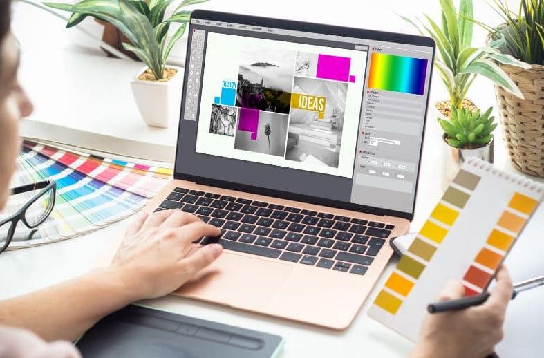
The process often begins with brainstorming sessions. These free-flowing, creative discussions encourage thinking beyond conventional boundaries. It's where wild ideas are welcomed, and the seeds of innovation are sown. Techniques like mind mapping or word association can kickstart these sessions, helping teams visualize concepts and themes that resonate with the brand's essence.

Mood boards are another critical tool in this phase. They are visual collages that combine images, colours, textures, and typography – all serving as a visual representation of the brand's desired look and feel. Mood boards act as a tangible reference point, ensuring that subsequent designs align with the brand's envisioned identity. They can be physical boards, digital collages, or samples and objects that capture the brand's essence.

Designing the Key Elements

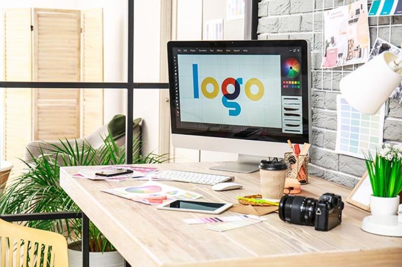
Once the conceptual groundwork is laid, it's time to design the key elements of the visual identity. This includes the logo, colour scheme, typography, and other visual components that will collectively communicate the brand's identity.

Designing a logo, arguably the most recognizable aspect of a brand's visual identity, requires a balance of simplicity, memorability, and relevance. The logo should encapsulate the brand's essence at a glance. Color scheme selection is equally critical. Colours evoke emotions and carry meanings, so choosing the right palette is paramount in conveying the right message. Take the color blue, for example: it often symbolizes trust and dependability, which is why it's a favored hue in the branding of many financial institutions.

Typography is another vital element. The font style used in the logo and other communications should reflect the brand's character. A tech company might opt for a sleek, modern font, while a luxury brand might prefer something more elegant and ornate.

Balancing creativity with brand messaging is essential throughout this design phase. While it's important to be innovative and unique, the designs must not stray too far from the brand's core values and personality.

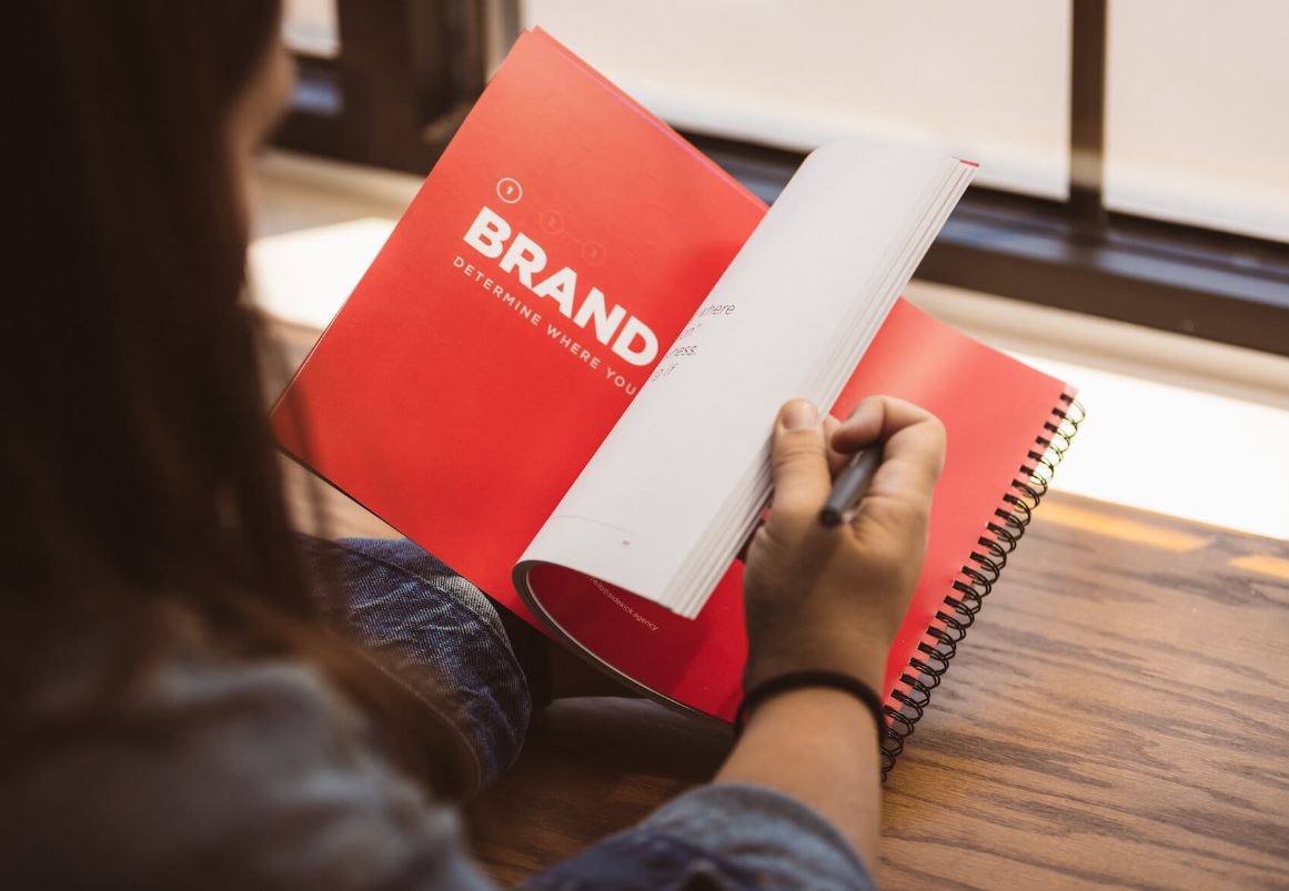
Creating Brand Guidelines

After the visual elements are designed, it's crucial to establish brand guidelines to ensure consistency across all applications. These guidelines are the rulebook for how the visual identity will be used and presented.

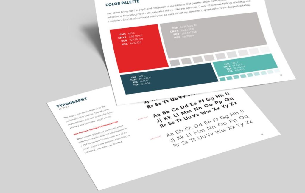
Brand guidelines typically include specifications for logo usage – detailing how and where the logo can be used, acceptable colour variations, and sizing. They also define the colour palette, providing exact colour codes for print, digital, and other media. Typography guidelines include font styles, sizes, and usage for different types of communications.

Additionally, brand guidelines may cover imagery style – what kind of photography or illustration aligns with the brand, and even tone of voice – how the brand communicates in written form. These guidelines ensure that the brand is represented consistently and accurately regardless of who is creating the content, maintaining its integrity and recognizability in the market.

Application Across Different Media

Once a visual identity is crafted, its application across various media becomes critical. In this stage, the brand's visual identity meets the real world – in digital platforms, print materials, and merchandise. Each medium presents unique challenges and considerations.

In digital media, which includes websites, social media, and online advertisements, the visual identity needs to be adaptable yet consistent. Digital platforms have varying requirements for image sizes, resolutions, and formats. The challenge is ensuring the logo, colour scheme, and typography are optimally displayed across different screen sizes and resolutions. For instance, a complex logo might need to be simplified to be recognizable even when scaled down for a mobile app icon.

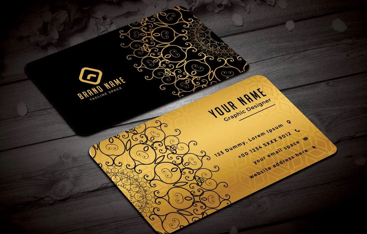
In print media, such as business cards, brochures, and billboards, the challenges include maintaining colour fidelity and ensuring the legibility of the typography. Print materials often serve as tangible brand touchpoints, hence the need for high-quality production to make a lasting impression.

Creating a Strong Visual Identity

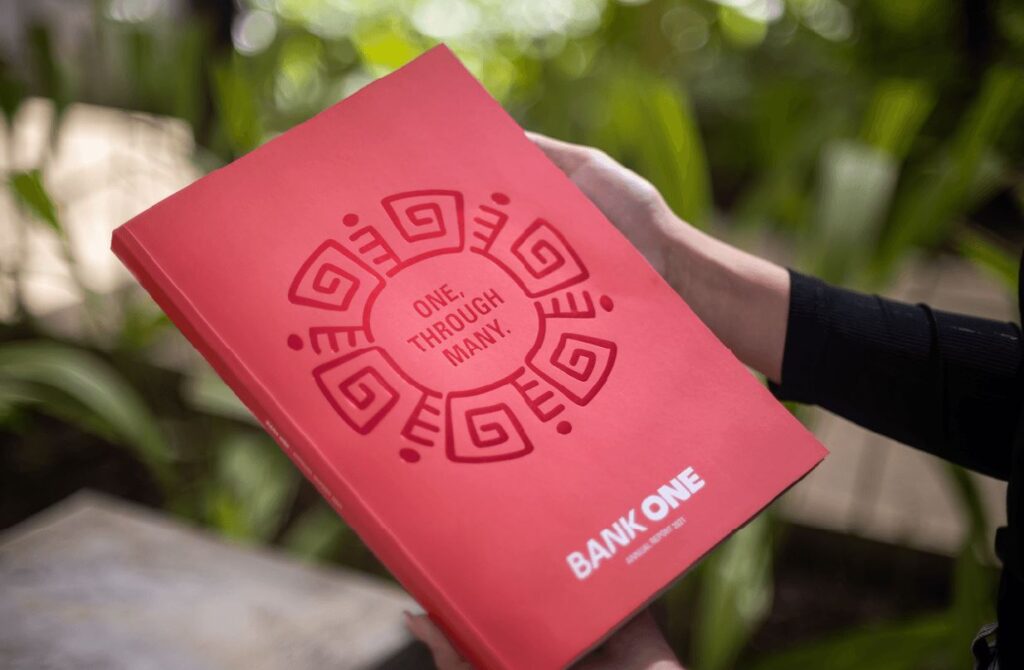
Merchandise, whether it's apparel, stationery, or promotional products, requires careful consideration of materials and printing techniques. The brand's visual elements must be adaptable to different materials while retaining their integrity and impact.

Gathering Feedback and Revising

Feedback is a crucial part of the visual identity development process. It helps refine and improve the design to effectively communicate the brand's message. Gathering feedback from stakeholders – including employees, management, and existing customers – provides valuable insights into how the visual identity is perceived.

Potential customers are another important source of feedback. They offer an outside perspective and can provide unbiased opinions on the visual appeal and clarity of the brand's identity.

Incorporating feedback effectively involves balancing different viewpoints while staying true to the brand's core values and goals. It might require revisiting certain design elements, tweaking colour schemes, or adjusting the overall visual approach. The key is to be open to constructive criticism and flexible in making changes while maintaining a clear vision of the brand's identity.

Launching the Visual Identity

Launching the new visual identity is a pivotal moment. It's an opportunity to re-introduce the brand to the world. Successful launch strategies often involve a well-planned campaign that creates anticipation and excitement.

This can include a teaser campaign on social media, an official launch event, or an email campaign to existing customers. The launch should tell the story of the new identity – why it was created, what it represents, and how it aligns with the brand's evolution.

Measuring the impact of the launch is essential. This can be done through metrics such as website traffic, social media engagement, media coverage, and customer feedback. Monitoring these metrics helps understand the reception of the new identity and provides insights for future branding initiatives.

Creating a strong visual identity is a comprehensive journey that involves understanding the brand, conceptualizing and designing visual elements, and applying them across various media. It requires a delicate balance of creativity, strategy, and consistency.

Throughout this post, we have explored the intricate steps involved in this process, from the initial stages of understanding the brand to the final launch of the new visual identity. Each phase in the development of a visual identity is critical, ensuring not just visual allure but also a deep alignment with the brand's fundamental values and a meaningful connection with its intended audience.

As we conclude, it's important to emphasize that creating a visual identity is not just about aesthetic appeal but crafting a story and personality that people can relate to and remember. Whether you are a business owner, a marketer, or a designer, approach visual identity creation with thoughtfulness, creativity, and a deep understanding of the brand's essence. The result will be a visual identity that not only stands out in the crowded marketplace but also endures and evolves with the brand over time.

Visual Identity Online

Visual Identity in the Digital Age: Adapting Your Brand for Online Platforms

In the ever-evolving landscape of the digital age, the concept of visual identity has transcended beyond traditional boundaries, becoming a crucial element in the online representation of brands. As we dive deeper into an era where digital platforms dominate consumer interactions, the adaptation of visual identity for online mediums has become a trend and a necessity for survival and success.

The digital realm offers a kaleidoscope of opportunities and challenges for brands to establish a compelling and memorable presence. From the intricate designs of websites to the dynamic interfaces of social media platforms, every digital touchpoint is an opportunity to showcase a brand's unique identity and ethos. However, the transition from traditional branding to a digital-centric approach is complex. It demands a keen understanding of the digital ecosystem and strategic integration of design principles that resonate with tech-savvy audiences.

This article will dive into the nuances of evolving your brand's visual identity to thrive in the online world. We'll explore key aspects such as the critical role of website and social media aesthetics, the essential need for mobile adaptability, and the crucial task of ensuring a consistent brand image across various digital platforms. As we navigate the challenges and triumphs of this digital branding journey, we will also draw insights from successful case studies and emerging trends.

Join us as we unravel the secrets of crafting a visual identity that not only stands out in the digital age but also creates a lasting impression in the minds of your audience.

Understanding Visual Identity in the Digital Context

Visual identity is a brand's collective set of visual elements to communicate its image. It includes logos, colour palettes, typography, imagery, and even the brand's tone and style of communication. These elements work together to create a distinctive and recognizable presence, influencing how the brand is perceived by its audience.

In the digital context, visual identity encompasses how a brand manifests itself online. This includes website design, social media profiles, digital advertising, email campaigns, and mobile applications. These touchpoints offer a unique opportunity to reinforce the brand's identity and values.

The rise of the digital age has dramatically transformed the realm of branding. Traditional branding often focuses on print media, television, and physical presence, such as storefronts or product packaging. Digital branding, however, revolves around the online world - websites, social media, online advertising, and more.

This shift is not merely about changing channels but also about adapting to new consumer behaviours. Online audiences have different expectations, such as interactivity, immediate access to information, and personalized experiences. Brands must evolve to meet these expectations while maintaining their core identity.

A major distinction between traditional and digital brand identities lies in the degree of interaction and engagement they offer. Online platforms offer more dynamic and interactive ways to present a brand, like animated logos, web designs, or engaging social media content.

Another difference lies in the adaptability of design. Digital platforms require visual elements to be flexible enough to be effective across various devices and screen sizes, from large desktop monitors to small smartphone screens.

The Role of Websites and Social Media

A website is often the first point of contact between a brand and its potential customers, making it a critical component of digital visual identity. Effective website design goes beyond aesthetics and must be intuitive, user-friendly, and accessible. The choice of colours, typography, imagery, and layout contributes to how the brand's identity is perceived.

Social media platforms are powerful tools for reinforcing and expanding a brand's visual identity. Each platform offers unique features that brands can use to engage with their audience. For instance, Instagram is highly visual and can showcase a brand's aesthetic, while Twitter's character limit encourages concise, impactful messaging that reflects the brand's voice.

Many brands have successfully integrated their visual identity across their websites and social media platforms. For example, a luxury fashion brand might use high-quality images and a sophisticated colour scheme on its website and Instagram profile, creating a seamless and elegant brand experience.

Mobile Responsiveness and App Design

Mobile responsiveness is no longer optional with the increasing use of smartphones for internet access. A mobile-friendly design ensures that a brand's visual identity is effectively displayed on smaller screens, maintaining legibility and usability without compromising aesthetic appeal.

Visual Identity Online

Mobile apps offer a unique way to engage with users, and the visual identity within an app should be consistent with the brand's overall look and feel. This includes using the same colour scheme, typography, and design elements. Additionally, app interfaces should be intuitive and align with the user's expectations for a seamless brand experience.

Successful examples of mobile app branding often come from brands that have seamlessly integrated their visual identity into the app experience. For instance, a popular coffee chain app reflects the brand's colours and logo and provides a user-friendly experience that reinforces the brand's focus on customer service.

Consistency Across Digital Channels

Consistency in visual identity across all digital platforms is crucial for brand recognition and recall. Consistency in branding fosters trust and credibility among audiences. Conversely, a lack of uniformity can create confusion and weaken the impact of your brand's message.

To maintain consistency, brands should develop a comprehensive digital brand guideline that outlines how visual elements should be used across different platforms. Regular audits of digital assets can also help identify areas where the brand identity is not being accurately represented.

One common pitfall is neglecting the updates and trends in digital design, leading to a dated appearance. Another is inconsistent messaging and visual elements across different platforms, which can confuse the audience and weaken the brand identity.

Adapting to Digital Trends and Technologies

The digital world is constantly in flux, with new design trends emerging regularly. Brands must stay informed about these trends to keep their visual identity fresh and relevant. This includes understanding the latest in web design, graphic styles, and even how content is presented. However, the challenge lies in distinguishing fleeting fads from lasting trends that align with the brand's identity.

Emerging technologies like Augmented Reality (AR), Virtual Reality (VR), and Artificial Intelligence (AI) offer exciting new avenues for brands to express their visual identity. For example, AR can be used for interactive advertising, bringing products to life in the consumer's environment. At the same time, AI can personalize user experiences on websites or apps based on user behaviour.

While it's important to stay current, brands must also ensure that their core identity remains consistent and recognizable. This balance between trendiness and timelessness is crucial. Adopting new styles or technologies should not come at the expense of the brand's established identity and values.

Interactive Elements and User Experience

Interactivity is a key aspect of digital branding, as it engages users and creates memorable experiences. Interactive elements like animations, hover effects, or storytelling can make a brand's digital presence more engaging and memorable.

A well-designed user interface that aligns with the visual identity enhances the user experience. This includes intuitive navigation, fast load times, and responsive design. A positive user experience reinforces the brand identity and encourages engagement and loyalty.

Many brands successfully integrate interactive elements into their online presence. For example, a tech company might use interactive product demos on its website, allowing users to explore features in an engaging way, thus reinforcing the brand's innovative image.

Challenges and Considerations

Adapting to digital platforms can present several challenges. These include maintaining brand consistency across various platforms, ensuring visual elements are adaptable to different formats and screens, and staying updated with the latest digital trends and technologies.

For a smooth transition, it's crucial to clearly understand the brand's core values and how they can be best represented digitally. Involving experienced designers and digital strategists in the process can be invaluable. Regularly reviewing and updating the digital strategy is essential to remain relevant and effective.

In conclusion, reshaping a brand's visual identity for the digital era demands a thorough grasp of the brand's fundamental essence alongside an acute awareness of digital platform intricacies. Keeping pace with evolving trends and technologies, weaving in interactive features, and prioritizing user experience are fundamental to carving out a successful digital footprint.

The digital age offers unprecedented opportunities for brands to express their identity and connect with audiences in dynamic ways. By embracing these opportunities and facing the challenges head-on, brands can create a strong and adaptable visual identity that resonates with today's digital audience. The key is to remain true to the brand's essence while exploring the exciting possibilities digital platforms offer.

Using Images and Graphics in Web Design

The Art of Visual Storytelling: Using Images and Graphics in Web Design

Within the dynamic and constantly changing world of web design, the practice of visual storytelling emerges as a vital and enchanting component. This art form transcends beyond mere decoration; it weaves a narrative that engages, informs, and inspires. In the blog post, we delve into the dynamic world where visuals are an aesthetic choice and a strategic communication tool.

The power of an image, the impact of a well-designed graphic, and the subtle messages conveyed through colour and layout – are the tools at the disposal of a skilled web designer. In today's fast-paced digital age, where content is rapidly consumed, the skill of efficiently and succinctly communicating complex ideas through visual means is more essential than ever. This post aims to explore how images and graphics can transform a standard website into a compelling story that captures the essence of a brand, idea, or message.

From understanding the psychology behind colour choices to dissecting the balance between text and imagery, we'll provide insights into how you can harness the power of visual elements to enhance user experience and communication. Regardless of your experience level in design, delving into the realm of visual storytelling will provide you with the tools and inspiration needed to enhance your web design endeavors.

Join us as we embark on this journey through the art of visual storytelling in web design, where each image is a chapter and every graphic a verse in the captivating story you wish to tell.

The Power of Visuals in Communication

The adage "a picture is worth a thousand words" holds profound significance in web design. Visuals, encompassing images, graphics, colour schemes, and typography, play a pivotal role in how information is communicated and perceived on the web. They not only add aesthetic value but also enhance the message's effectiveness.

Examining the role of visuals in communication highlights their power to grab attention, stir emotions, and leave enduring impressions. For example, visuals are processed by the human brain at a rate 60,000 times faster than text, making them instantly more captivating than written words. This immediacy is crucial in the digital world, where users often scan content rather than read it in detail.

Statistics and studies have consistently demonstrated the superiority of visuals over text in web content. According to the Social Science Research Network, 65% of people are visual learners, which means they absorb and retain information better through visual aids. Furthermore, articles with images receive 94% more views than those without, as reported by Jeff Bullas, a renowned marketing expert. This data underscores the importance of integrating visuals into web design to effectively capture and retain the audience's attention.

Elements of Visual Storytelling in Web Design

  1. High-Quality Images: The use of high-quality images is non-negotiable in web design. They are not just decorative elements but crucial tools for storytelling. High-resolution images ensure clarity and professionalism, while the relevance of the imagery to the content enhances the overall message. The right image can convey emotions, set the content's tone, and influence user behaviour.
  2. Graphics and Illustrations: While images capture reality, graphics and illustrations add a layer of creativity and abstraction that can sometimes communicate more effectively. They can uniquely simplify complex ideas, add personality to the web content, and make abstract concepts tangible. For instance, a well-designed infographic can make data and statistics more digestible and engaging.
  3. Colour Schemes and Layout: The choice of colours and layout plays a vital role in setting the mood of a website and guiding user attention. Colours can evoke certain emotions and create associations with a brand. A well-thought-out colour scheme can increase brand recognition by up to 80%. Similarly, a strategic layout guides the viewer's eye across the page, ensuring that key information is noticed.
  4. Typography: Typography is arranging type to make the text legible, readable, and appealing when displayed. The right choice of font and typeface complements the visual elements and enhances the website's overall aesthetic. Good typography establishes a visual hierarchy, provides a graphic balance, and sets the product's tone.

Strategies for Effective Visual Storytelling

  1. Consistency in Style: Consistency is key in visual storytelling. Maintaining a uniform style throughout the website is essential to create a coherent narrative. This includes consistent use of colour schemes, typography, and imagery styles. Maintaining uniform visual aesthetics is key to forging a robust brand identity and ensuring that a website remains unforgettable.
  2. Balancing Text and Imagery: While visuals are powerful, the text is equally important. The challenge lies in striking the right balance between text and imagery. The text should complement the visuals and vice versa. An overload of either can overwhelm the user and detract from the message. The aim is to use images to break up text, making it more readable, and to use text to add context to images, making them more meaningful.
  3. Using Infographics: Infographics are a powerful tool in visual storytelling, especially when dealing with complex information or data. They combine graphics, images, and text to present information concisely and visually engagingly. Infographics can simplify complex topics, making them accessible and memorable. They are particularly useful in educational content, where understanding and retention are key.
  4. Incorporating Branding: Effective visual storytelling isn't just about aesthetics; it's also about branding. Every visual element on a website should align with the brand's identity and values. This includes consistently using brand colours, logos, and typefaces across the website. The inclusion of branding elements within visual components not only strengthens brand recognition but also fosters a deeper connection with viewers.

Challenges and Considerations

The field of visual storytelling in web design, while rich with advantages, also presents its own unique set of challenges and factors to consider. One common pitfall is the overloading of a website with visuals. While engaging, too many images or graphics can distract from the main message, slow down the site's loading time, and overwhelm the user. Finding a balance where visuals complement rather than dominate the content is crucial.

Another challenge is the selection of appropriate images. Every visual element should align with the brand's message and audience's expectations. Inappropriate or off-brand images can confuse the audience and detract from the website's credibility.

Using Images and Graphics in Web Design

Accessibility and responsiveness are also critical considerations. Web designs must be accessible to all users, including those with disabilities. This means ensuring that visuals are complemented with alternative text for screen readers and designing for various screen sizes and orientations to guarantee a consistent experience across devices.

Best Practices and Tips

  1. Choosing the Right Visuals: Select visuals that resonate with your target audience and reflect the brand's personality. Ensure that images are high quality and relevant to the content. Stock photos can be useful, but custom images or graphics often provide a more authentic experience.
  2. Creating Original Graphics and Images: Originality stands out. Consider creating custom graphics and images that align perfectly with your content. Use tools like Adobe Photoshop or Illustrator for graphic design or platforms like Canva for more straightforward graphic creation.
  3. Resources and Tools for Web Designers: Numerous resources and tools are available to assist web designers in creating effective visual storytelling. Websites like Unsplash and Pexels offer high-quality, free stock photos. Tools like Sketch and Figma are excellent for UI/UX design, while Adobe XD and InVision are useful for prototyping.

Future of Visual Storytelling in Web Design

The future of visual storytelling in web design is poised to be more interactive and immersive, thanks to emerging technologies.

  1. Augmented Reality (AR) and Virtual Reality (VR): AR and VR are set to revolutionize web design by creating more immersive experiences. They can bring products to life, offer users a virtual 'try-before-you-buy' experience, or create engaging, interactive storytelling experiences that transcend traditional web browsing.
  2. 3D Graphics: 3D graphics in web design is expected to grow, providing a more dynamic and realistic user experience. This can be particularly impactful in industries like real estate, where 3D tours can provide a more tangible sense of space.
  3. Evolution of Visuals: As technology advances, the role of visuals in web design will continue to evolve. We can expect more personalized and interactive visuals driven by AI and machine learning, offering a more tailored user experience.

The journey through the art of visual storytelling in web design has highlighted the undeniable power and importance of visual elements in enhancing user experience and communication. We've seen how well-chosen images, graphics, colour schemes, and typography can beautify a website and significantly elevate its ability to tell a compelling story.

We discussed the critical role of high-quality visuals in capturing attention and conveying messages effectively. Balancing text with imagery, ensuring accessibility, and maintaining brand consistency emerged as key considerations for a successful design. Challenges such as avoiding visual overload and selecting appropriate images were also addressed, emphasizing the need for thoughtful design choices.

The exploration of best practices provided practical guidance on choosing the right visuals, creating original graphics, and utilizing various resources and tools available to web designers. Looking towards the future, we delved into the exciting potential of emerging technologies like augmented reality, virtual reality, and 3D graphics, which are set to redefine the boundaries of web design.

As we conclude, it's important to remember that visual storytelling in web design is an ever-evolving art form. It offers a vast canvas for creativity and innovation. Whether you are an experienced designer or just beginning your journey, I encourage you to embrace and experiment with these principles and techniques in your design work. Embrace the challenge of integrating compelling visuals into your designs to create more engaging, effective, and memorable websites. The world of visual storytelling is vast and rich with possibilities; it's up to you to explore it and bring your unique visions to life.

Typography in Signage

Typography in Signage: Choosing the Right Fonts for Your Brand

In the bustling streets of our cities and the crowded spaces of the digital world, signage stands as a silent yet powerful communicator of brand identity. The font choice in these signages goes beyond mere aesthetics; it is a critical decision that can significantly influence how a brand is perceived and remembered. Typography, the art of arranging type, plays an essential role in this visual dialogue between brands and their audience.

The right font can convey a brand's story, ethos, and values without saying a word. It can make a brand feel elegant, robust, approachable, or cutting-edge. Conversely, an ill-suited font choice can muddle a brand's message and detach it from its intended audience. In this blog post, we delve into the intricacies of typography in signage and guide you through choosing the right fonts that align seamlessly with your brand's identity.

From understanding the basics of typography, including the nuances of serif and sans-serif, to exploring how font choice impacts brand perception, this post is designed to be your compass in the vast sea of typefaces. We will discuss practical considerations such as readability, context, and audience demographics and provide insights into popular fonts and their associated brand messages. Whether you're looking to refresh your existing signage or starting from scratch, this guide will empower you with the knowledge to make informed typography choices that resonate with your brand's unique voice.

Understanding Typography Basics

Typography is an art form that speaks volumes in silence. It's the crafting and arranging text to make written language legible, readable, and appealing when displayed. At the heart of typography in signage are several key terms and concepts that are essential to grasp.

Firstly, serif and sans-serif fonts. Serif fonts, like Times New Roman, are characterized by small lines or strokes attached to the end of a larger stroke in a letter or symbol. These serifs make text easier to read in print, conveying a sense of tradition, respectability, and reliability. In contrast, sans-serif fonts like Helvetica lack these extending features. They offer a cleaner, more modern appearance and are often used in digital contexts for clarity and simplicity.

Kerning and leading are also crucial in typography. Kerning refers to adjusting space between individual letter pairs to ensure a harmonious and visually pleasing arrangement. Effective kerning prevents the text from appearing uneven or cluttered, vital in signage where every millisecond of viewer attention counts. Leading, on the other hand, is the space between lines of text. Proper leading enhances readability, especially in larger blocks of text, ensuring that the message is easily digestible at a glance.

Typography in Signage

Different fonts convey different moods and messages. For instance, a script font like Brush Script can convey elegance or creativity and is often used in brands that want to appear unique or artistic. On the other hand, a bold, blocky font like Impact can communicate strength and assertiveness, suitable for brands looking to make a strong impression.

Significance of Font Choice in Branding

The font choice in signage is not just a matter of aesthetic preference; it significantly impacts brand perception. The right font can reinforce a brand's personality and values, while the wrong one can undermine them.

Take, for example, Coca-Cola's iconic cursive script. This font choice exudes a classic, friendly, and approachable vibe, aligning perfectly with the brand's long-standing identity. Similarly, Apple's sleek, minimalist font in its branding complements its image of modernity and innovation. These examples illustrate how font choices are integral to how a brand is perceived and remembered.

Factors to Consider When Choosing Fonts for Signage

When selecting fonts for signage, several factors need consideration to ensure the message is seen and resonated with the audience.

Readability is paramount. The font size and legibility at various distances are critical, especially in signage. Larger, clearer fonts like Arial or Helvetica are often used for their readability, especially in high-traffic areas or where viewers may be at a distance. It's essential to choose a font that is aesthetically pleasing and easy to read from far away and at different angles.

Context also plays a significant role. The location and environment where the signage will be displayed heavily influence the font selection. Outdoor signs, for instance, require fonts that stand out against the complexities of an outdoor setting, whereas indoor signage might allow for more intricate or delicate font styles. Environmental factors like lighting, surrounding colours, and weather conditions can affect how a sign and its typography are perceived.

Audience is another critical factor. The brand's target demographic should be at the forefront when selecting a font. A younger, more dynamic audience might resonate more with modern, bold fonts, while a more mature audience might prefer traditional, serif fonts. Understanding the audience helps in choosing a font that represents the brand and connects with the viewers.

Popular Fonts for Signage and What They Communicate

Various fonts have gained popularity in signage due to their distinct characteristics and the messages they convey.

Helvetica, for example, is widely used for its neutrality and clarity, making it a go-to choice for brands aiming for a modern, clean look. It communicates straightforwardness and honesty.

Garamond, a classic serif font, is often associated with elegance and credibility. It's preferred for brands that want to portray a sense of tradition and reliability.

Futura, with its geometric shapes and even weight distribution, gives off a feeling of efficiency and forward-thinking. It's suitable for brands that want to appear contemporary and progressive.

Comic Sans, while often criticized, conveys informality and approachability. It's a font that might be chosen by brands looking to appear playful and accessible, though its use should be carefully considered due to its controversial reputation.

Each of these fonts, with their unique styles and characteristics, communicates something different about a brand. The key is to align the font choice with the brand's identity, values, and the message it wants to convey to its audience.

Combining Fonts Effectively

The art of pairing different fonts is a subtle yet impactful aspect of typography in signage. It can elevate a brand's visual appeal and enhance readability when done correctly. Here are some tips and best practices for effectively combining fonts:

  1. Contrast is Key: Combine a serif with a sans-serif to create a balance. The contrast between these two types makes the signage more dynamic and engaging.
  2. Limit the Number: Generally, it's best to limit the number of different fonts to two or three. Too many font styles can create a cluttered and confusing appearance.
  3. Hierarchy and Function: Use different fonts to establish a hierarchy of information. For instance, a bold, attention-grabbing font for the main message and a simpler, more readable font for secondary information.
  4. Consistency in Style: Ensure your fonts share a common style or mood. Fonts that are too disparate can make your signage look disjointed.
  5. Avoid Overly Decorative Fonts: While they may look attractive, overly decorative fonts can be hard to read, especially from a distance or at a glance.

Custom Fonts and Brand Identity

Custom fonts have become a powerful tool in establishing a unique brand identity. These tailored fonts are designed to directly reflect a brand's personality and ethos.

For instance, Google developed its custom font, 'Google Sans', to improve readability across its platforms while maintaining a distinctive look. Similarly, Netflix created 'Netflix Sans' to have a versatile font for all its marketing needs, saving on licensing costs and establishing a strong visual identity.

Custom Fonts and Brand Identity

These case studies highlight how custom fonts can make a brand stand out and ensure consistency across various mediums and platforms.

Legal Considerations

When choosing fonts for commercial signage, legal considerations must be taken into account. Fonts are intellectual property, and licensing agreements govern their use.

  1. Understand Font Licensing: Different fonts come with different types of licenses. Some are free for commercial use, while others require purchasing a license.
  2. Avoid Copyright Infringement: Using a font without the proper license can lead to copyright infringement, which can have legal and financial consequences.
  3. Custom Font Licensing: If opting for a custom font, ensure that the terms of use and ownership are clear in the contract with the designer.

Future Trends in Typography for Signage

As we look to the future, several trends and innovations in typography design are emerging:

  1. Sustainable and Eco-Friendly Fonts: Fonts designed to reduce ink usage and be more eco-friendly are gaining popularity.
  2. Interactive and Animated Typography: With the rise of digital signage, we're seeing more interactive and animated text, which can change in response to viewer interaction or environmental factors.
  3. Inclusive and Accessible Design: There's a growing focus on creating fonts accessible to people with disabilities, including those with visual impairments.
  4. Technology Integration: Integrating augmented reality (AR) and virtual reality (VR) in typography offers new ways to engage and interact with audiences.

In summary, the journey through the world of typography in signage has highlighted its crucial role as a strategic tool in brand building. We began by understanding the basics of typography, including the distinctions between serif and sans-serif fonts and the importance of kerning and leading. This foundation set the stage for appreciating how different fonts convey varying moods and messages, significantly impacting brand perception.

We discussed the importance of choosing the right font for signage, considering factors like readability, context, and audience demographics. This choice is not merely a design decision but a strategic one, with the power to influence how a brand is perceived and engaged.

The art of combining fonts effectively was explored, emphasizing the importance of contrast, hierarchy, and style consistency. We also delved into custom fonts, showcasing how they can be a game-changer in creating a unique brand identity, as evidenced by case studies from brands like Google and Netflix.

Legal considerations, especially regarding font licensing and copyright, were also addressed, underscoring the importance of navigating these aspects responsibly to avoid potential legal pitfalls.

Looking ahead, we touched upon future trends in typography, from sustainable and eco-friendly fonts to the integration of interactive and digital technologies, highlighting how typography is evolving in the digital age.

In conclusion, typography in signage is much more than choosing attractive fonts. It's a nuanced art form that plays a pivotal role in communication, brand identity, and audience engagement. As we have seen, thoughtful typography can elevate a brand, enhance its message, and create a lasting impression. Therefore, businesses, designers, and marketers need to consider typography not just as an element of design but as a strategic tool in building and strengthening their brand's presence in an ever-competitive market.

Eco-Friendly Packaging

Eco-Friendly Packaging: A Guide to Sustainable Design

In an era increasingly defined by environmental consciousness, the shift towards eco-friendly packaging is not just a trend but a crucial pivot in how we think about and interact with the products we use daily. Traditional packaging, often reliant on materials harmful to our planet, has led to significant environmental challenges, including pollution and overflowing landfills. In response to this growing concern, sustainable design in packaging has emerged as a beacon of hope, offering a path forward that aligns with our planet's needs.

Eco-friendly packaging goes beyond just using recyclable materials; it encompasses a holistic approach to design that considers the entire lifecycle of packaging. From production to disposal, sustainable packaging aims to minimize environmental impact, offering a responsible and forward-thinking solution. This guide delves into sustainable packaging, exploring its benefits, the innovative materials involved, and the design principles that guide its creation.

Whether you're a consumer keen on making environmentally conscious choices, a business owner looking to transition to greener practices, or simply someone curious about the future of packaging, this comprehensive guide will illuminate the vital role eco-friendly packaging plays in our journey towards a more sustainable world.

What is Eco-Friendly Packaging?

Eco-friendly packaging, synonymous with sustainable packaging, involves the creation and utilization of packaging solutions designed to significantly reduce environmental impact and ecological footprint. It involves designing and using beneficial packaging materials, or at least non-harmful, to the ecosystem. This approach transcends just incorporating recyclable materials; it considers the entire lifespan of packaging, from the procurement of raw materials, through the production and usage phases, to its ultimate disposal.

The key characteristics of sustainable packaging include biodegradability, recyclability, reusability, and reduced materials used. Biodegradable materials break down naturally into non-toxic components, while recyclable materials can be processed and reused, reducing the need for virgin resources. Reusability involves designing packaging that can be repeatedly used for the same or other purposes, prolonging its life cycle and minimizing waste. Importantly, sustainable packaging often involves reducing the overall amount of material used, known as source reduction, which directly impacts the ecological footprint of the packaging.

Eco-Friendly Packaging

In contrast, traditional packaging materials – such as certain plastics, styrofoam, and specific types of inks and dyes – often contain non-renewable, non-biodegradable elements that accumulate in the environment, particularly in landfills and oceans. Such materials are notorious for their persistence over centuries and pose potential harm to wildlife and natural ecosystems.

The Benefits of Eco-Friendly Packaging

The shift towards eco-friendly packaging brings several key benefits:

  1. Environmental Benefits: The most direct impact of sustainable packaging is on the environment. Eco-friendly packaging solutions help reduce the carbon footprint of products by using materials that are either derived from renewable sources or are easier to recycle. This leads to a significant reduction in pollution and waste, especially in landfills and oceans. Furthermore, sustainable packaging often produces less energy, contributing to lower greenhouse gas emissions.
  2. Economic Advantages: Contrary to popular belief, sustainable packaging can be cost-effective in the long run. With increasing consumer demand for environmentally friendly products, businesses that adopt sustainable packaging will likely see an uptick in consumer interest and loyalty. Moreover, as the demand for recyclable materials grows, the economics of recycling improve, potentially reducing costs associated with packaging materials.
  3. Social Impact: By choosing eco-friendly packaging, companies send a strong message about their commitment to environmental stewardship. This can raise consumer awareness about environmental issues and encourage a shift in societal norms and behaviours towards more sustainable practices.

Materials Used in Sustainable Packaging

A variety of materials are used in sustainable packaging, each with its own set of advantages and challenges:

  1. Recycled Paper and Cardboard: These are the most common eco-friendly packaging materials. They are widely recyclable and, when sourced responsibly, represent a sustainable option. However, the recycling process can be energy-intensive, and the quality of paper can degrade with each recycling cycle.
  2. Bioplastics: Made from renewable biomass sources, such as cornstarch and sugarcane, bioplastics are a popular alternative to traditional plastics. They often have a lower carbon footprint and can be biodegradable. However, their production can compete with food sources and may require specific conditions to decompose effectively.
  3. Glass and Aluminum: Both of these materials boast a 100% recyclability rate and maintain their quality through endless recycling cycles. While they are resource-intensive to produce, their longevity and recyclability make them sustainable choices.
  4. Edible and Water-Soluble Materials: Innovative materials like edible packaging made from natural food-grade ingredients and water-soluble packaging that dissolves in water are emerging. These solutions are particularly intriguing for single-use products and can significantly reduce waste. However, their practicality and cost-effectiveness in mass production are still under evaluation.
  5. Plant-Based Packaging: Packaging made from plant fibres like bamboo, coconut, or seaweed is gaining popularity. These materials are typically biodegradable, compostable, and sourced from rapidly renewable resources. The challenge lies in scalability and performance compared to traditional materials.
  6. Mushroom Packaging: This innovative material is made from mycelium, the root structure of mushrooms, combined with agricultural waste. It is fully compostable and can be grown into custom shapes, offering a viable alternative for protective packaging. The limitation is its current niche application and production scale.

Each of these materials has its strengths and weaknesses. Recycled paper and cardboard are widely accepted and recycled, but their durability and strength can be limiting factors. Bioplastics offer a reduced carbon footprint but can create confusion in waste management systems if not properly disposed of. Glass and aluminium provide excellent durability and recyclability. Still, their weight and energy-intensive production are drawbacks. Edible and water-soluble materials offer innovative waste reduction possibilities but may face limitations regarding durability and protective qualities. Plant-based and mushroom packaging are promising in sustainability, but their current market penetration and production costs are challenges.

The field of eco-friendly packaging is continually evolving, with new materials and technologies emerging regularly. For instance, advancements in material science have led to the development of compostable bio-based polymers that behave like traditional plastics but break down in composting environments. Nanotechnology is being explored to create ultra-thin, strong, and lightweight packaging materials. Digital technologies like QR codes and blockchain are also being integrated into packaging to enhance recycling processes and supply chain transparency.

Design Principles for Sustainable Packaging

Sustainable packaging design is not just about the materials used; it's also about how the packaging is designed. Key principles include:

  1. Minimizing Material Use: This involves creating packaging that uses the least material necessary to achieve its purpose. It's about efficiency and reduction, which lowers material costs and reduces waste and environmental impact.
  2. Design for Recycling or Composting: Packaging should be designed to make it easy to recycle or compost. This means considering the ease of disassembly and the compatibility of materials used in the packaging.
  3. Use of Non-toxic Materials and Inks: Sustainable packaging avoids materials and inks that harm the environment. Using soy or vegetable-based inks and avoiding toxic adhesives and plastics ensures that the packaging does not contribute to pollution during its lifecycle.
  4. Examples of Effective Eco-Friendly Packaging Designs: Many companies have successfully implemented these principles. For example, some use mono-material packaging made from a single material, making recycling easier. Others have adopted minimalist designs that reduce material use while maintaining functionality and aesthetic appeal.

Challenges and Considerations

Adopting sustainable packaging is not without its challenges:

  1. Cost and Availability: Initially, eco-friendly materials can be more expensive or harder to source than traditional materials. This can be a significant barrier for small businesses or regions with limited access to sustainable materials.
  2. Addressing Misconceptions and Educating Consumers: There's a need to educate consumers about the benefits of sustainable packaging and how to properly dispose of it. Misconceptions about the effectiveness and quality of eco-friendly packaging can also hinder its adoption.
  3. Legislation and Industry Standards: Navigating the evolving landscape of regulations and standards can be complex. Legislation varies widely by region and can impact the materials and designs used in sustainable packaging.

Eco-Friendly Packaging

Future Trends in Eco-Friendly Packaging

In the future, a variety of trends are poised to significantly influence the evolution of sustainable packaging:

  1. Emerging Innovations and Technologies: Advances in materials science are likely to bring new, more sustainable materials to the forefront. Technologies like 3D printing could enable more efficient production methods, reducing waste and energy use.
  2. Predictions for the Future of Packaging in Terms of Sustainability: There's anticipated to be a greater shift towards circular economy models, where the end-of-life of packaging is considered at the design stage. Biodegradable and compostable materials are expected to become more mainstream, and we may see a rise in reusable and refillable packaging systems.

The journey through the world of eco-friendly packaging highlights a crucial transition in our approach to consumption and waste management. In an age where environmental impact is a paramount concern, the shift towards sustainable packaging practices is not just a responsible choice; it's an essential one. Eco-friendly packaging stands at the intersection of innovation, environmental stewardship, and consumer responsibility, offering a path to mitigate the harm caused by traditional packaging methods.

Sustainable packaging represents a critical step in reducing our carbon footprint, minimizing waste, and conserving resources. By embracing materials and designs that prioritize the planet's health, we can significantly lessen the environmental impact of our consumption habits.

This guide serves as an informative resource and a call to action for both businesses and consumers. Adopting eco-friendly packaging is an opportunity for businesses to lead by example, demonstrating a commitment to sustainability that resonates with a growing segment of environmentally conscious consumers. It's an investment in a greener future and a chance to innovate in ways that align with the planet's needs.

Consumers, on the other hand, wield significant power through their purchasing choices. Opting for products with sustainable packaging sends a clear message to the market about consumer preferences and values. It's also an act of participating in a larger environmental sustainability movement.

In conclusion, the path to a more sustainable future is paved with big and small choices. Adopting eco-friendly packaging practices is one such choice, with the potential to create a ripple effect that benefits the current generation and those to come. Let us embrace this shift enthusiastically and commit to our planet's health and future generations' well-being.

Business Card Design

Minimalist vs. Creative: Choosing the Right Business Card Design for Your Brand

In the fast-paced world of business, first impressions are crucial. One of the quintessential tools for making that lasting impression is the business card – a small but powerful symbol of your professional identity. As the digital era continues to evolve, the traditional business card remains a staple in networking, embodying your brand's essence in a tangible form. However, how do you ensure your business card stands out in a sea of competitors? The answer lies in its design.

This blog post delves into two popular design paradigms that have dominated the world of business cards: Minimalist and Creative. While a minimalist design prides itself on its clean, uncluttered aesthetics and timeless appeal, a creative design breaks the mould with its bold use of colour, innovative shapes, and unique materials. Each style has unique strengths and speaks volumes about your brand's personality and values.

But the question remains: Which is the right choice for your brand? Through this exploration of minimalist and creative business card designs, we'll guide you in making a decision that aligns with your brand identity and resonates with your target audience. Whether you're a seasoned professional or a budding entrepreneur, understanding the impact of your business card's design is key to making meaningful connections and leaving a memorable impression.

Understanding Minimalist Business Card Design

Simplicity, clean lines, and a monochromatic colour palette characterize minimalism in business card design. This design philosophy hinges on 'less is more,' where every element is purposeful and free of extra details.

Minimalist design is defined by its straightforward approach. It typically includes white space, limited colour schemes, and minimal text or graphic elements. The font choices are usually clean and sans-serif, enhancing readability and conveying a sense of modernity.

Advantages of Minimalist Business Cards

  1. Professional Appeal: Minimalist cards exude a professional and sophisticated vibe. They are uncluttered, making them easy to read and understand at a glance.
  2. Timeless Design: Trends come and go, but minimalist design remains timeless. Its classic appeal ensures that your business card never looks outdated.
  3. Focus on Essential Information: With minimal design, the emphasis is on the content rather than the decoration. This makes it easier for recipients to find and remember important details like your name, title, and contact information.

Minimalist business cards are particularly effective in industries where professionalism and clarity are paramount. This includes sectors like law, finance, consulting, and technology. They are also ideal for individuals who want their credentials or personal brand to take centre stage without competing with the design.

Exploring Creative Business Card Design

On the opposite spectrum of minimalist design is creative design. This approach is all about standing out and making a bold statement. Creative business cards often incorporate vibrant colours, unique materials, and unconventional shapes.

Creative business card design is characterized by its use of innovative elements that catch the eye. This can include unusual shapes (circular, triangular, die-cut), a variety of textures (embossing, foil stamping), and a mix of materials (wood, metal, plastic). The colour palette is often broader and more daring compared to minimalist designs.

Benefits of Creative Business Cards

  1. Standing Out: In a stack of standard cards, a creative business card is more likely to grab attention and be remembered.
  2. Showcasing Brand Personality: These cards allow for a more expressive representation of your brand's personality, whether it's playful, artistic, or unconventional.
  3. Memorable Impact: The uniqueness of a creative business card can leave a lasting impression, making potential clients or partners more likely to recall your brand and contact you.

Business Card Design

Creative business cards are particularly beneficial for industries where creativity and innovation are key. This includes graphic design, advertising, fashion, and the arts. They are also ideal for businesses that want to project a fun, approachable, or avant-garde image.

Factors to Consider When Choosing Your Design

Alignment with Brand Identity

  • Minimalist Design: This style is ideal for brands that want to convey a sense of sophistication and seriousness. It works well for businesses that value clarity, efficiency, and a no-nonsense approach.
  • Creative Design: Youthful, innovative, or artistic brands can benefit from creative design. This style suits companies that want to showcase their creativity and out-of-the-box thinking.

Target Audience

  • Minimalist Design: A minimalist design can be more appealing if your target audience appreciates clarity and professionalism. It is often preferred by audiences in corporate sectors or those who value straightforwardness.
  • Creative Design: Creative designs are more likely to attract a younger or more dynamic audience. If your target demographic appreciates uniqueness and originality, this design can make a stronger impact.

Industry Standards

  • Minimalist Design: In industries like law, finance, and consulting, a minimalist design aligns well with industry norms, projecting an image of reliability and formality.
  • Creative Design: In fields such as marketing, design, and the arts, creative business cards can help stand out and align with the innovative spirit of these industries.

Tips for Each Design Type

For Minimalist Design

  • Emphasizing Simplicity: Keep the design clean and uncluttered. Use minimal colours and graphics to maintain focus on the essential information.
  • Choosing High-Quality Materials: The quality of the paper or material used can greatly enhance the card's impact. Opt for premium materials to complement the minimalist design.
  • Maintaining Brand Consistency: Ensure your business card aligns with your overall brand aesthetic, including logos, colour schemes, and typography.

For Creative Design

  • Encouraging Innovation: Don't be afraid to experiment with unconventional shapes, vivid colours, and unique materials. This can help your card stand out.
  • Ensuring Legibility and Professionalism: While being creative, it's crucial to ensure that the card is still legible and maintains a professional appearance.
  • Testing Different Designs: Before finalizing a design, consider creating multiple prototypes. This allows you to test how your design is received and make necessary adjustments.

The journey of selecting the perfect business card design is more than just a matter of aesthetic preference; it's a strategic decision that can significantly impact your brand's first impression and ongoing professional relationships. As we've explored, the choice between minimalist and creative designs is not just about visual appeal, but about conveying your brand's story, values, and identity in a compact, tangible form.

The importance of choosing the right business card design cannot be overstated. This small piece of paper is a physical reminder of your brand and can influence how potential clients, partners, and contacts perceive your business. With its clean lines and uncluttered layout, a minimalist design speaks to a brand that values professionalism, clarity, and a no-frills approach to business. On the other hand, a creative design, bursting with colours, unique materials, and innovative shapes, can showcase a brand's creativity, energy, and willingness to break the mould.

As you stand at this crossroads, deciding between a minimalist or creative business card design, you must reflect deeply on your brand's identity and the message you wish to convey. Consider your brand's values and how these can be best represented visually. Equally important is understanding your target audience – their preferences, expectations, and the message that will resonate with them.

Remember, your business card is more than just a way to share contact information; it's a small but powerful branding tool. Whether you choose a minimalist design for its elegance and timeless appeal or a creative design for its uniqueness and ability to stand out, ensure that it aligns with your overall branding strategy and effectively communicates your brand's ethos.

In making this choice, you're not just selecting a design – crafting a key component of your brand's narrative. So, take the time to consider, explore, and ultimately select a design that truly reflects the essence of your brand and appeals to the audience you wish to connect with. Your business card is a gateway to future opportunities, a symbol of your brand's story, and a small but significant step in building lasting professional relationships.